

Inspirational Interiors: Quantity vs. Quality
cushion styling tips
Less is more… (sometimes)
We’re sure you’ll be relieved to hear that we’re seeing a move away from overly styled cushion layouts.
The well-known quote springs to mind:
“Less is more.” — Ludwig Mies van der Rohe
Quality over quantity is definitely the way forward.
Think considered, intentional styling.
You want your cushion selection to feel like considered design accents, rather than fussy decorative clutter.
Obviously there is not fixed rule and you should choose what works best for your home and lifestyle.
BUT we have put together a simple guide below on what we recommend.
Let’s get started…
Mix, don’t match
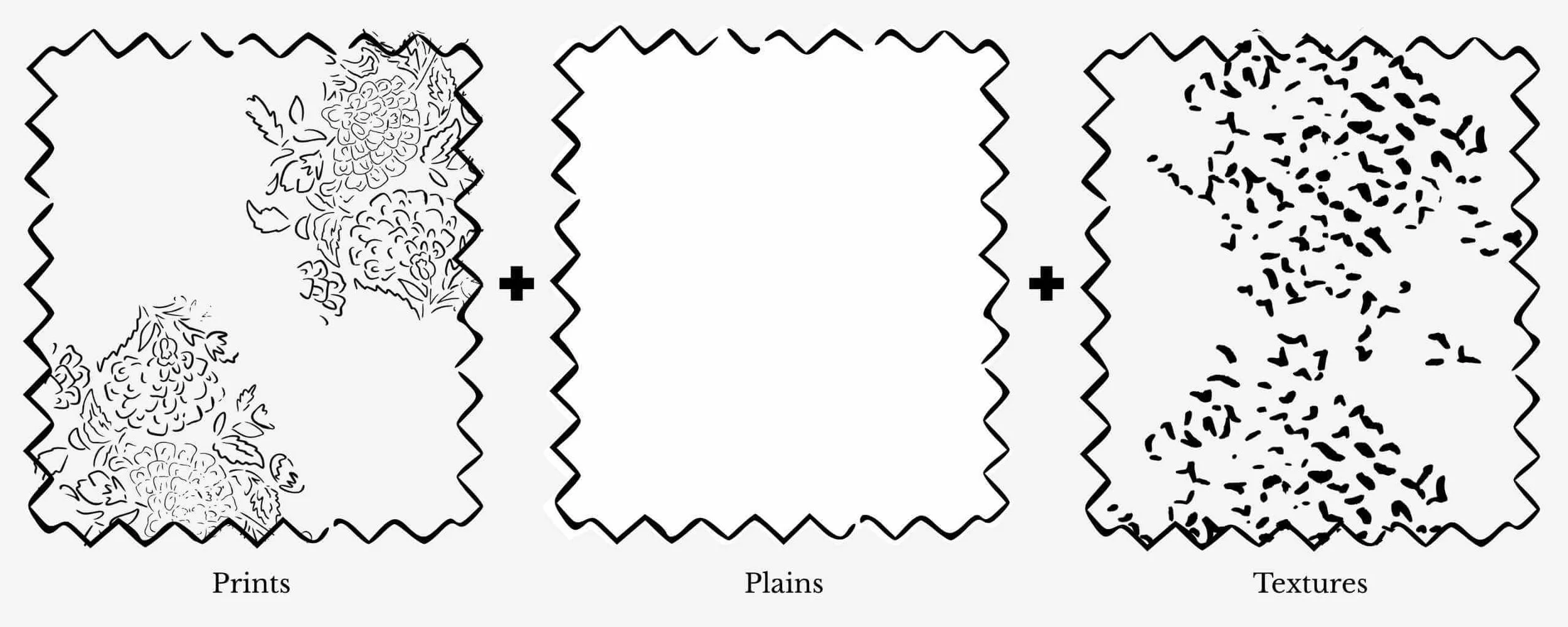
This is where people can often hold back.
Be confident with your choices:
Combine prints, plains, and textures
Avoid anything too “perfectly matched” - A slight contrast, in pattern, scale, or texture will add depth and interest.
Pattern doesn’t have to feel scary either - A simple stripe or a textured woven design can be just as effective as something bright and bold.
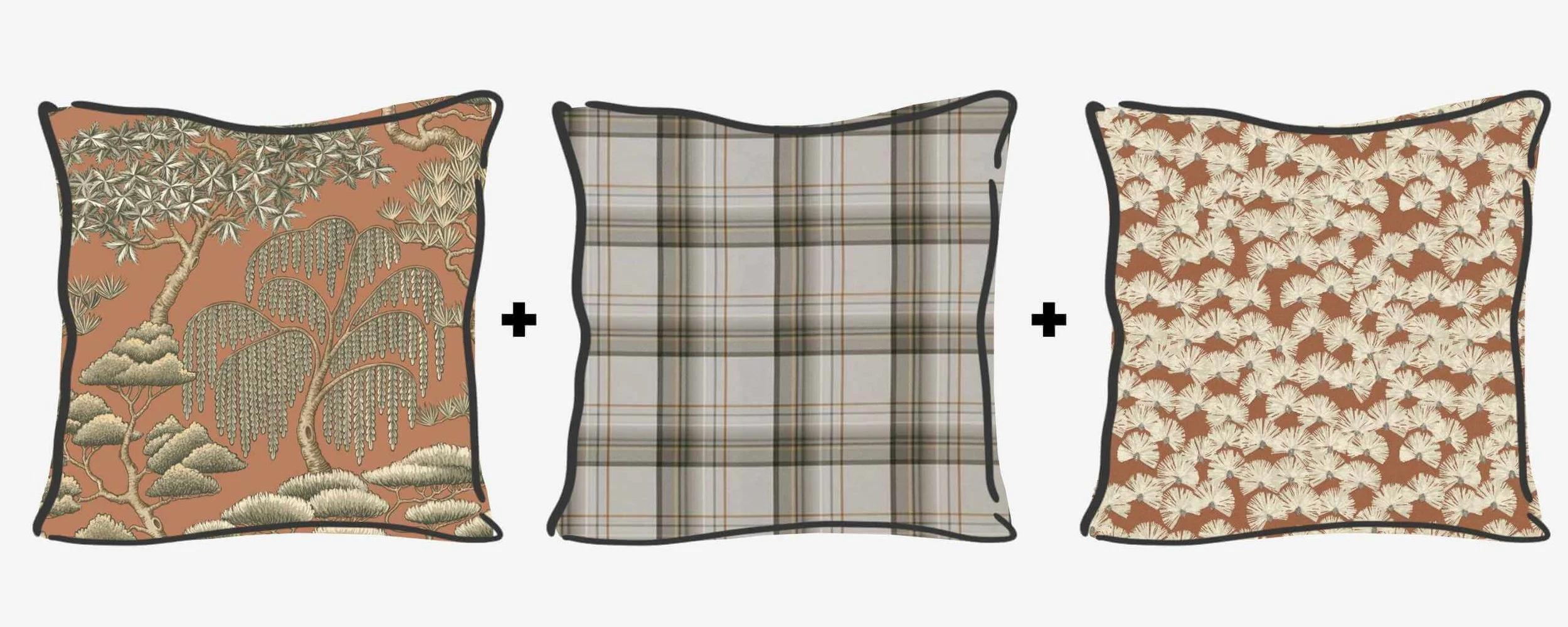
EXAMPLE - LARGE SCALE PRINT + HERITAGE PLAID + SMALL SCALE PRINT
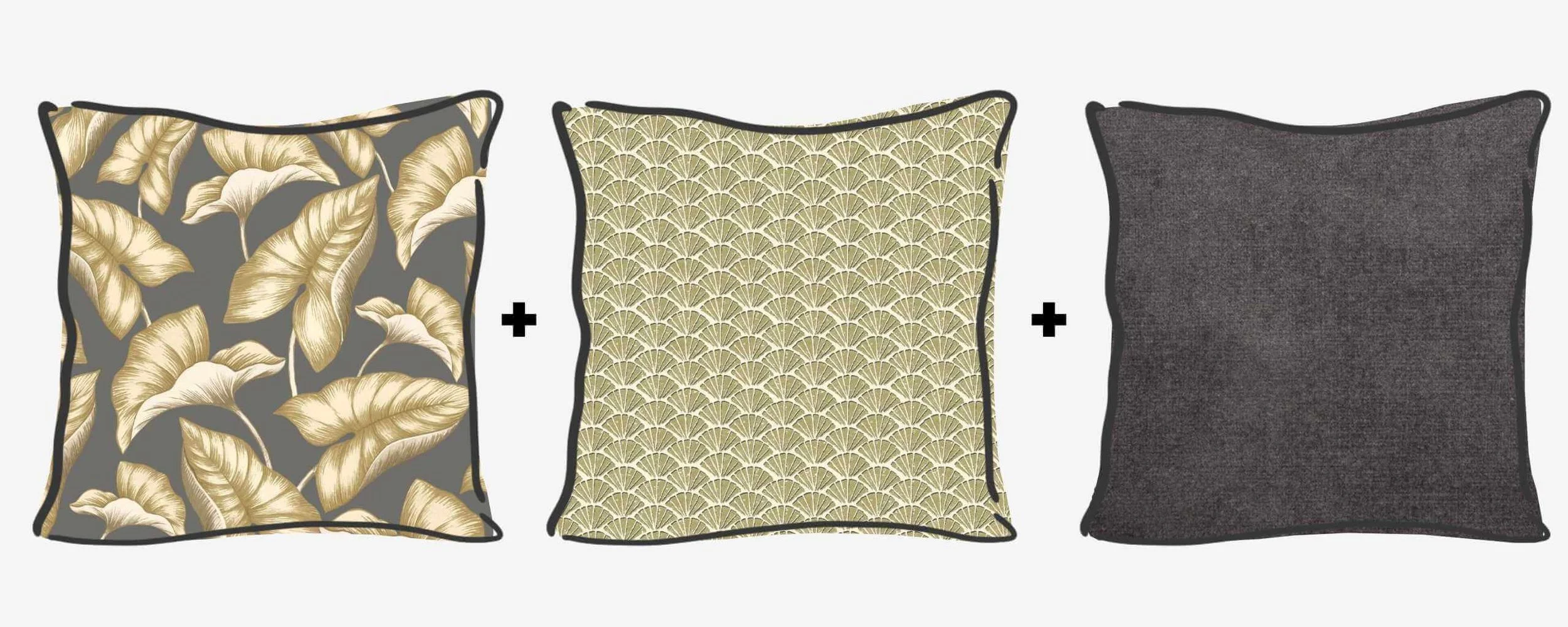
EXAMPLE - LARGE SCALE PRINT + SMALL SCALE PRINT + PLAIN
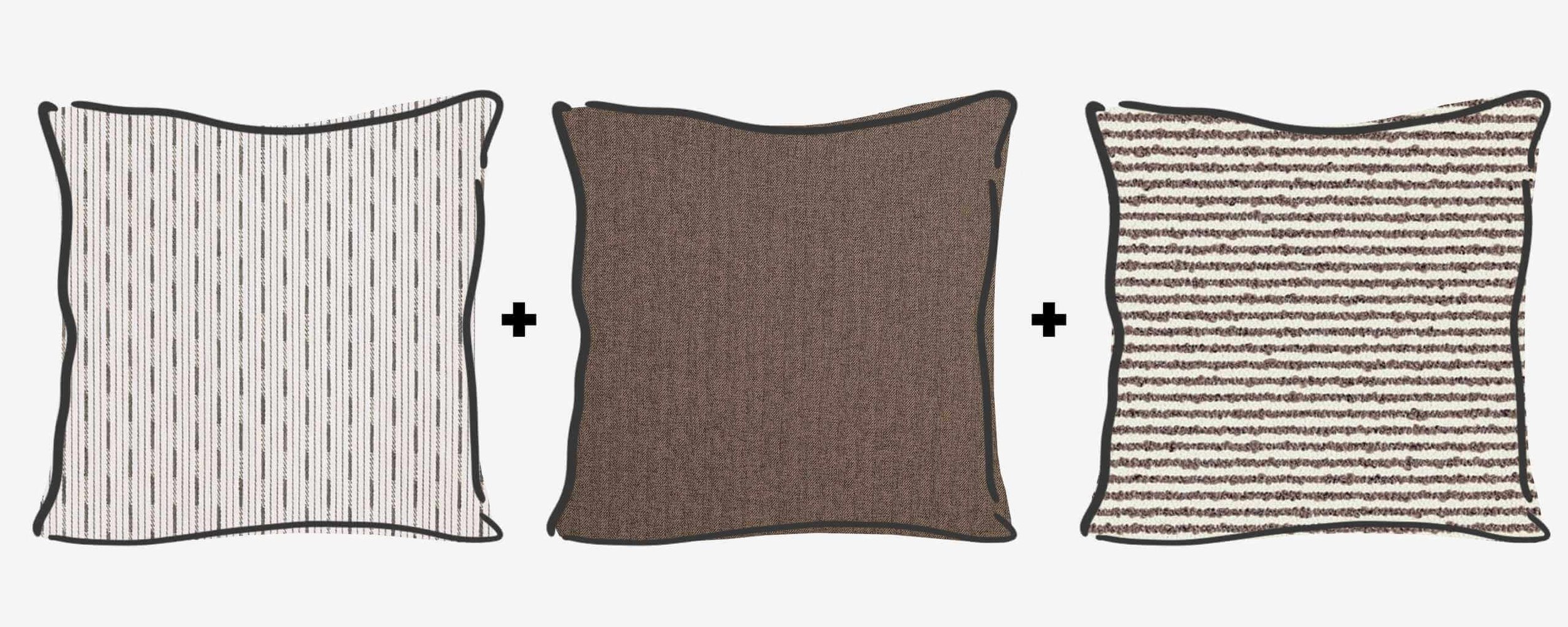
EXAMPLE - STRIPED WOVEN + PLAIN TEXTURED + TEXTURED STRIPE WOVEN
Considered and Curated
Think of it like a capsule wardrobe for your bed or settee.
Paring things back allows you to rotate seasonally with ease.
Styling should feel effortless, not overly symmetrical or staged.
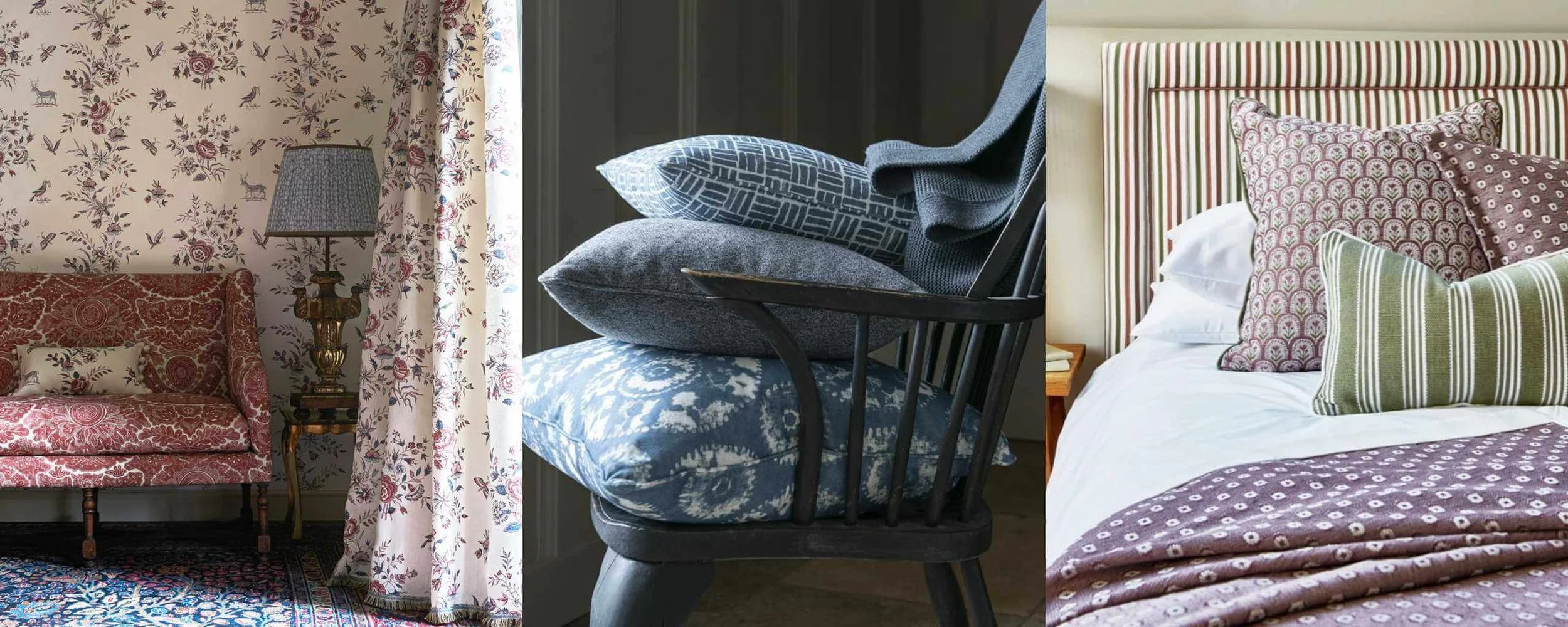
IMAGES: Lewis & Wood, The Pure Edit and Prestigious Textiles
Cushions should make a room feel like it’s yours!
Cushions are one of the easiest ways to bring personality into a room.
They should reflect you, not just trends.
Want to learn more? Read our guide to cushion styling formulas, sizing, and layout!